One of my favorite ‘looks’ is the sort of old-collage feel of old photos and old paper. It’s a favorite because it lets you work images and text together really easily. In this tutorial we’ll put together a poster where there is a main photograph and a lot of text using the old-collage feel.
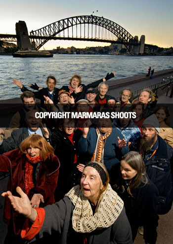
www.sydneystreetchoir.com. The brief was to promote the event using this really nice photo (shown) of the choir down by the Sydney Harbour Bridge shot by John Marmaras and including some written copy, which I’ve shown below the image.
Unfortunately there is a lot of text to go on the poster and although this image is gorgeous, it is very busy, so using the photo as the background for the poster would present problems in getting all that text working over the top. I know this is a problem because I spent an hour trying to make it work before deciding that I should try something else!
SYDNEY STREET CHOIR
Performs With
Jonathon Welch
from THE CHOIR OF HARD KNOCKS
Mark Trevorrow
aka BOB DOWNE
Massed Choir of 110 People
Gabriel’s Big Band
Also Featuring Jeremy Brennan
Tuesday 27 Nov 2007 At 7:30PM
Northside Conference Centre
Cnr Oxley St & Pole Lane, Crows Nest
Tickets: $35
All Proceeds to Sydney Street Choir
Tickets Tel: 9439 7822
SYDNEY STREET CHOIR connects with, inspires and empowers, those who are living or working in homeless or disadvantaged communities, through creating music, performance and passionate expression, that truly opens people’s hearts.
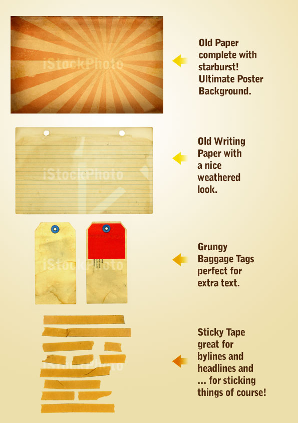
The first place we go is to iStockPhoto where I found these four images that I will use to put the poster together. You can purchase the four items from iStock by clicking these links: 1 2 3 4
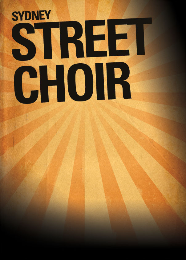
Next I placed the text on the page. I have used Univers Condensed for this poster. Because I knew there was going to be a lot of text, using a condensed font seemed like a good idea so that it’d be easier to get it all in. With the main heading "Sydney Street Choir," I tried a few permutations before deciding that Sydney wasn’t a particularly important word and by shrinking it down I could make "Street Choir" a lot larger and punchier.
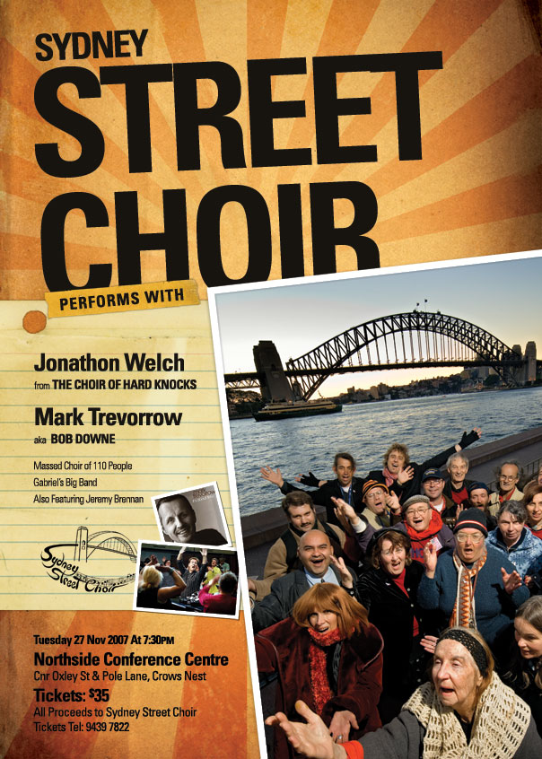
After that I used a large soft brush and in a new layer painted black over the top right corner and around the bottom. I then set this layer to Overlay so that it would darken the paper but in an organic way. You can see the result in the following image and the painted areas in the image just below.
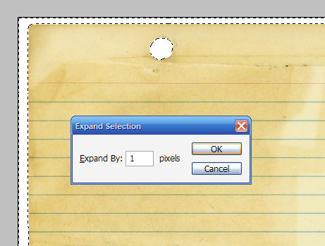
Once you have the white selection expanded, press Shift+Ctrl+I to invert the selection and then you can hit Ctrl-C to copy the image out and paste it into the main image.
Note also that the text is also set in Univers Condensed (in various weights) and the type sizes are relatively ordered. It’s important to have some consistency and continuity in your text–don’t just have a huge assortment of different sizes and weights and fonts, or things can start to look a little chaotic. So the moral of the story is variation is good, too much variation is bad!
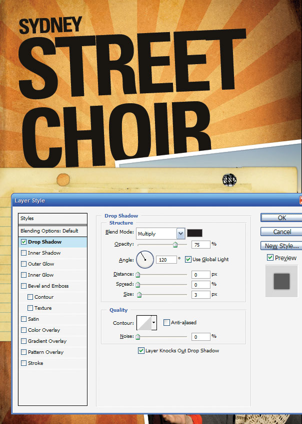
You’ll also see that I’ve pasted in a couple of extra photos (of the two main acts) and used the same Layer Style of Drop Shadow + thick white border on them – but have sized them down accordingly so that the white border didn’t overwhelm the photos. I’ve also transformed and rotated each so it all looks a little random.
Finally there is also the "sydney street choir" logo which I was told late in the day needed to be on the poster (gotta love last minute client changes!). Now it’s going to be difficult to cut that logo out because it’s complex, but fortunately it’s black on a white background which means all we need to do is set it to "Multiply" and the white will blend away leaving the logo stamped on the paper.
I’ve also pasted in the venue details down at the bottom and given the text some treatment to highlight and fade back various parts (as we did with the performer list). Unfortunately, the text is getting lost down there and since the venue and time is pretty important we need to do something about that!
Step 1
This tutorial is based on a job I did a few days ago for a charity client who needed a poster to promote an upcoming event. They are a choir made up of homeless people called the Sydney Street Choir and it’s a pretty neat little organization that you can learn about atwww.sydneystreetchoir.com. The brief was to promote the event using this really nice photo (shown) of the choir down by the Sydney Harbour Bridge shot by John Marmaras and including some written copy, which I’ve shown below the image.
Unfortunately there is a lot of text to go on the poster and although this image is gorgeous, it is very busy, so using the photo as the background for the poster would present problems in getting all that text working over the top. I know this is a problem because I spent an hour trying to make it work before deciding that I should try something else!

The Text…
www.sydneystreetchoir.comSYDNEY STREET CHOIR
Performs With
Jonathon Welch
from THE CHOIR OF HARD KNOCKS
Mark Trevorrow
aka BOB DOWNE
Massed Choir of 110 People
Gabriel’s Big Band
Also Featuring Jeremy Brennan
Tuesday 27 Nov 2007 At 7:30PM
Northside Conference Centre
Cnr Oxley St & Pole Lane, Crows Nest
Tickets: $35
All Proceeds to Sydney Street Choir
Tickets Tel: 9439 7822
SYDNEY STREET CHOIR connects with, inspires and empowers, those who are living or working in homeless or disadvantaged communities, through creating music, performance and passionate expression, that truly opens people’s hearts.
Step 2
So if the photo-as-poster model isn’t going to work, then we need another look. I decided to put together what I call the old-collage feel. This is a good one to work with as it’s very easy to combine elements on a page since everything is meant to look a little messy anyway.The first place we go is to iStockPhoto where I found these four images that I will use to put the poster together. You can purchase the four items from iStock by clicking these links: 1 2 3 4

Step 3
To begin with I used the starburst paper as background by pasting it into the background layer, pressing Ctrl-T to rotate and resize it accordingly.Next I placed the text on the page. I have used Univers Condensed for this poster. Because I knew there was going to be a lot of text, using a condensed font seemed like a good idea so that it’d be easier to get it all in. With the main heading "Sydney Street Choir," I tried a few permutations before deciding that Sydney wasn’t a particularly important word and by shrinking it down I could make "Street Choir" a lot larger and punchier.
After that I used a large soft brush and in a new layer painted black over the top right corner and around the bottom. I then set this layer to Overlay so that it would darken the paper but in an organic way. You can see the result in the following image and the painted areas in the image just below.

Step 4
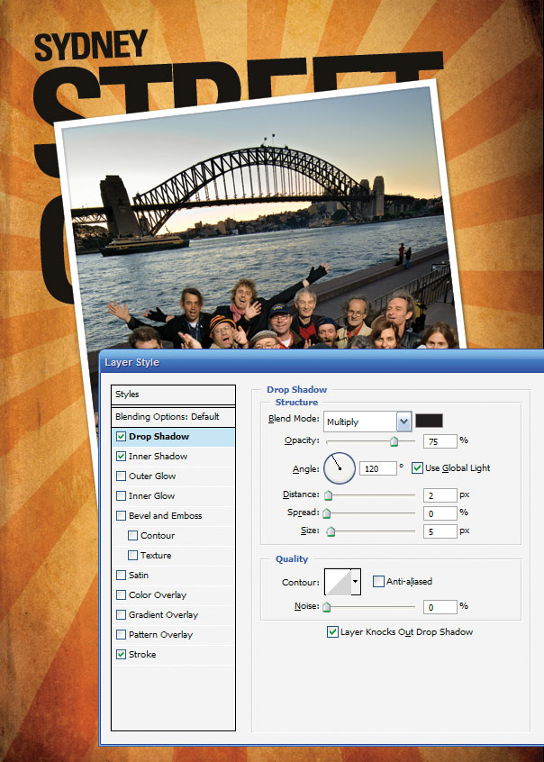
Next I placed the photo on the stage and because I wanted it to look like something thrown down on a piece of paper I gave it a thick white border. I also added a faint drop shadow so that the photo looked to be interacting with the background. With this look your aim is to get the various pieces of the composition interacting with each other on the canvas. You can do this by overlapping, shadows, adjusting the lighting to match, adjusting coloring to match, and so on.
Step 5
Next I wanted to add the paper on to the stage. Because all three items (the paper, the tape, and the baggage tag) are isolated on white, it’s quite simple to cut them out. Just use the Magic Wand Tool (W) with a Tolerance set to about 32, then click in the white areas, holding Shift down so you can select them all. Then go to Select > Modify > Expand and use a value of 1px. This cuts out a thin border across the whole image and ensures there is no white on the edges. It’s a quick and dirty technique, and if you wanted to cut something more complex then you might use a better extraction technique.Once you have the white selection expanded, press Shift+Ctrl+I to invert the selection and then you can hit Ctrl-C to copy the image out and paste it into the main image.

Step 6
After pasting in the object, I added a small drop shadow and moved the paper behind the photo layer (which I had settled in the bottom right corner so as to leave lots of room for text along the left).
Step 7
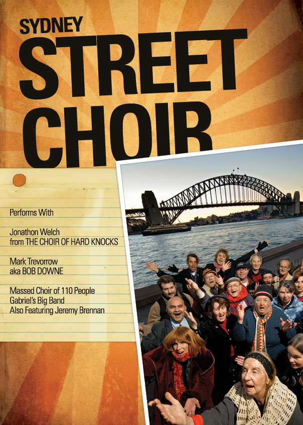
Now we start adding the text. In the image below, all I have done is paste the text in and space it out a little with line breaks. This looks sort of OK, but is pretty boring with everything being uniform. It’d be much better if we worked on the type a little to give it some variation and highlight the more important parts.
Step 8
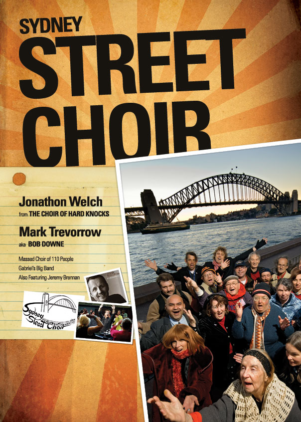
Here you can see I’ve changed the text so that the names of the main two performers are highlighted, the words ‘from’ and ‘aka’ are shrunk right back since they aren’t important and ‘the Choir of Hard Knocks’ and ‘Bob Downe’ are subtitles. The other three performers (who aren’t as well known) are also shrunk back and will be only really read if the person is really interested. We want people passing by to see the title (Sydney Street Choir) followed by the big acts (Welch and Trevorrow) and hopefully that will draw them close enough to read the rest.Note also that the text is also set in Univers Condensed (in various weights) and the type sizes are relatively ordered. It’s important to have some consistency and continuity in your text–don’t just have a huge assortment of different sizes and weights and fonts, or things can start to look a little chaotic. So the moral of the story is variation is good, too much variation is bad!
You’ll also see that I’ve pasted in a couple of extra photos (of the two main acts) and used the same Layer Style of Drop Shadow + thick white border on them – but have sized them down accordingly so that the white border didn’t overwhelm the photos. I’ve also transformed and rotated each so it all looks a little random.
Finally there is also the "sydney street choir" logo which I was told late in the day needed to be on the poster (gotta love last minute client changes!). Now it’s going to be difficult to cut that logo out because it’s complex, but fortunately it’s black on a white background which means all we need to do is set it to "Multiply" and the white will blend away leaving the logo stamped on the paper.

Step 9
Next I pasted in one segment of the tape image from iStockPhoto and have arranged it to look like it’s holding the paper down. Then I’ve written the "Performs With" text over the top to turn it into a subtitle linking the headline and body copy.I’ve also pasted in the venue details down at the bottom and given the text some treatment to highlight and fade back various parts (as we did with the performer list). Unfortunately, the text is getting lost down there and since the venue and time is pretty important we need to do something about that!

Step 10
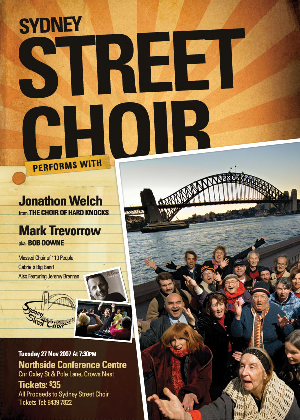
So in a layer down the bottom just above the background I pasted in a dark brown rectangle as shown (just grab the selection tool, draw one in and fill it with dark brown) and then set the layer blending mode to Multiply. This effectively makes the bottom much darker and now we can invert the text color to a beige color. In case you are wondering the beige color was selected off the paper above it using the Eyedropper tool since it’s always nice to keep colors matching on the image.
Step 11
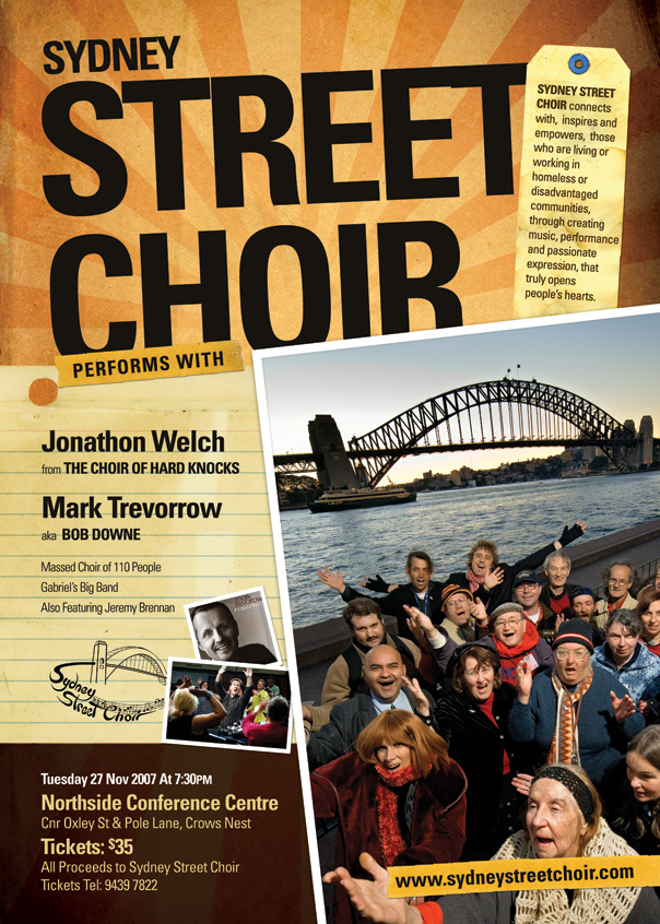
Finally, I have pasted in the baggage tag up in the top right corner and layered it in between the title text and photo then pasted in that rather long paragraph of description text. And with that we’re complete! At this point to send it off to print, we would switch off all the text layers (except the main title) and save as a TIFF file, then open up InDesign, create a new document and place the TIFF file in. Then we would copy in the text in InDesign to make sure it shows up nice and sharp in the final print out poster. But since this site doesn’t really deal in InDesign we won’t go too much into that. I’ve included it, though, as a few people mentioned this in the comments of the last tutorial :-)


0 Response to "Creating a Poster using photoshop"
Post a Comment