The best book I’ve ever read on drawing is one called Drawing on the Right Side of the Brain. After reading it, I’m still pretty bad at drawing, but I did learn a lot about light and shade. In this tutorial we are going to take some very basic principles of light and shade to make a rather impressive-looking text effect.
if you like. Now tell me what other Photoshop tutorial site gives you diagrams? It’s like being back in school!



Now Ctrl-click the text layer again and create a new layer beneath the text layer. Now press the down arrow on your keyboard once and the right arrow on your keyboard once. Then press Alt+Backspace to fill it with black. Then press down and right again one time and fill with black. Each time you will be moving 1px right and 1px down. You should repeat this process about 30 times (which is why it’s important to use Alt+Backspace instead of the Fill tool).
Note also that to move the selection but not the fills when you press your arrow keys, you have to have one of the Marquee tools on. If you switch to the Move Tool (V) when you press down and right you will actually move the black fill as well as the selection and will just be filling the same pixels over and over.


Set this thin white line layer to about 80% Opacity.






 http://psd.tutsplus.com/tutorials/text-effects-tutorials/using-light-and-shade-to-bring-text-to-life/

Light Sources
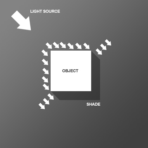
So before we start the tutorial, here is a little diagram about how light might hit an object. Here we have a square object in the middle with light coming from the top left. You can see that where the light hits the object, a shadow is cast on the other side. Note that the shadow is not a Photoshop drop shadow, which makes the object look like it’s hovering above the canvas. Here we want the object to look like it’s a three dimensional thing stuck on the canvas, extrudingif you like. Now tell me what other Photoshop tutorial site gives you diagrams? It’s like being back in school!

Step 1
We begin the tutorial by drawing a subtle Linear Gradient from dark grey to darker grey. Note that because we want our light to come from the top left, that’s where the lighter part of the document is.
Step 2
Now we place some text. I’ve used a very cool font called Agency FB, which has a condensed, hard-edge feel to it. You should make the text a grey-ish blue color – #c2c8d4 to be precise.
Step 3
Next Ctrl-click the text layer and create a new layer above it. In the new layer, with that selection still held, draw a linear gradient of #495a79 to transparent from bottom right to left. So in other words you are darkening the bottom right as shown.
Step 4
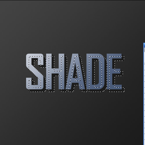
Set your foreground color to Black (you can do this by pressing the letter ‘D’ on your keyboard which restores the defaults).Now Ctrl-click the text layer again and create a new layer beneath the text layer. Now press the down arrow on your keyboard once and the right arrow on your keyboard once. Then press Alt+Backspace to fill it with black. Then press down and right again one time and fill with black. Each time you will be moving 1px right and 1px down. You should repeat this process about 30 times (which is why it’s important to use Alt+Backspace instead of the Fill tool).
Note also that to move the selection but not the fills when you press your arrow keys, you have to have one of the Marquee tools on. If you switch to the Move Tool (V) when you press down and right you will actually move the black fill as well as the selection and will just be filling the same pixels over and over.

Step 5
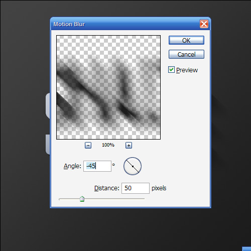
Here’s what you should now have. Now deselect and make sure you are on the shadow layer, then go to Filter > Blur > Motion Blur and use values of -45 degrees and a distance of 30px.
Step 6
Set your shadow layer to Multiply and about 40% Opacity and then hold down Shift and press the down arrow and then the right arrow. This will move your object right and down 10px each (Shift tells Photoshop to go 10px at a time instead of 1). Now you may have some of the blurred parts of the shadow sticking out to the top and left of the object. If this is the case, grab a small soft eraser and gently erase away anything which shouldn’t be shaded (remember the diagram at the beginning).
Step 7
Next duplicate the shadow layer, hold Shift and move it down and right again. Then run the Motion Blur filter again with a distance of 50px this time and set this layer to Multiply and 20% Opacity. This is just to give our shadows more of a trail off.
Step 8
Now create a new layer above all the other layers, hold down Ctrl and click the main text layer to select its pixels and back on your new layer fill the selection with White. Don’t let go of the selection just yet though. Instead press down and right one time to move 1px away and then hit Delete.Set this thin white line layer to about 80% Opacity.

Step 9
As you can see, the thin white line gives a sort of highlight effect where the light source is hitting the text and gives the impression that the text is more three dimensional.
Step 10
Next we want to create some streams of natural light. Create a new layer above all the others and draw four or five white rectangles approximately similar to those shown (i.e. getting fatter as they go down).
Step 11
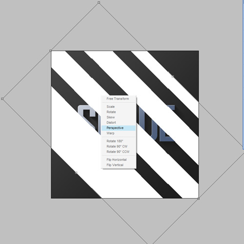
Now press Ctrl+T to transform and rotate and enlarge the rectangles as shown. Now normally you’d press Enter when you’re finished, but this time don’t let go just yet. Instead, right-click and you will get a pop up menu showing you other types of transforms you can do. Choose Perspective. The reason it’s important to do this in one step is so that you don’t lose your bounding box. So take the top left two points and bring them closer together so that the light appears to be coming from one place and spreading out.
Step 12
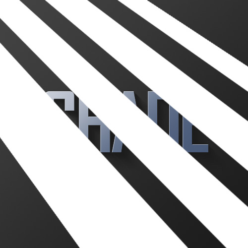
Here we have our four strips of "light." Now set the layer to Overlay and 20% Opacity and then go to Filter > Blur > Gaussian Blur and give it a blur radius of 6px.
Step 13
You should now have something that looks like this.
Step 14
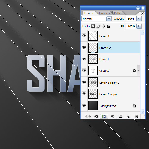
Now since those thin strips are meant to be light, it would make sense if our highlight layer only showed up where the light was hitting right? So Ctrl-click the light layer and then click on the highlight layer from earlier, then while the selection is still on, click on the Add Layer Mask button (it’s the one at the bottom of the layer palette to the right of the ‘f’ icon). This will create a Mask that only shows the highlight layer where the light overlaps it.
Step 15
So you could stop here; it’s already looking pretty good, but we’ll finish this effect off by adding some warm lighting.
Step 16
So first of all create a new layer just above the background and fill it with a pinkish color – #9d506c.
Step 17
Now set the pink layer’s blending mode to Colour and the opacity to 20%. This gives our background a nice reddish-warmth. Over the top of this we can now mix in some yellows. If we don’t put in the reddish cast underneath, the result comes out looking overly yellow and not particularly real.
Step 18
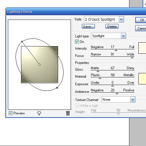
Next we create a layer just above the pink. Fill it completely with white and then go to Filter > Render > Lighting Effects. I don’t often use Lighting Effects, but it does have one very cool preset called the Two O’clock Spotlight, which you can select by going to Style at the top and looking through the options. You can pretty much use this as default, but for our purposes it helps to extend the ellipse to make it a little longer (i.e. the spotlight is a little further off).
Step 19
Now we set the lighting layer to Overlay and you have something like shown below. Now duplicate that layer, move it above all the other and set it to 40% Opacity. This makes sure that our warm lighting is also interacting with the text and not just the background.
Conclusion
Finally, we duplicate the top lighting layer one more time and set it to 65% Opacity, then click the Add Layer Mask button on the layers palette again and draw a linear white to black gradient from top left to bottom right. This makes the extra lighting layer fade off as it goes down right.


0 Response to "Using Light and Shade to Bring Text to Life"
Post a Comment