
Step 1:
We begin with a dark grey to black gradient. I drew this with the Radial Gradient, which long-time readers will know is my favorite gradient tool. Anyhow don’t worry too much about these colors, because midwaythrough the tutorial, I decided they were too dark and changed them!

Step 2:
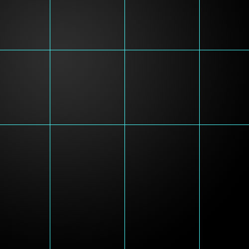
Now press Ctrl-R to switch on your rulers and drag some guides out. You do this by clicking on the ruler and then keeping your mouse down and dragging out to where you want them to be. I set up my guides as shown below. Because I’m drawing a triangle, I want to make sure that it’s symmetric and not wonky – hence the guides.Note that at any time you can press Ctrl+’ and the guides will switch on and off. This is useful because otherwise they get in the way of what you’re trying to do sometimes.
Also with the rulers you can right-click on the rulers and you’ll see the different measurements they work in. For Web graphics it’s probably easiest to work in pixels (though for print you’d want something larger probably). Anyhow because my canvas is 500×500, I put the guides at 100px, 250px, and 400px and then 100px and 250px downwards.
Step 3:
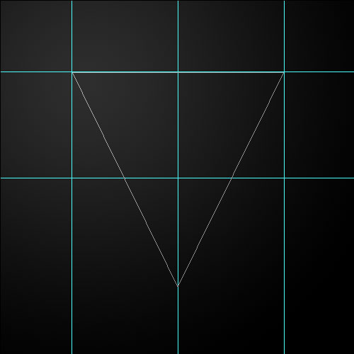
Next grab the Pen Tool (P) and draw a triangle as shown. You can do this with three dots (yes all the high school math is worthwhile after all!). Note that if you hold the mouse down when you place dots you’ll get into the curvy pen thing (it’s technical name is bezier curves) and we’re not interested in those today, so just click once to get nice angled points.Also if you hold down Shift you’ll find you get the Pen Tool snapping to lines which are in multiples of 45 degrees. This can be good particularly if you want to draw the dead straight line at the top (and not accidentally place a mark a few pixels off). Alternately I suppose you could make sure you have snapping on which is under View > Snap To > Guides. Either way should get you the right result. As always Photoshop gives you a zillion ways to do everything.
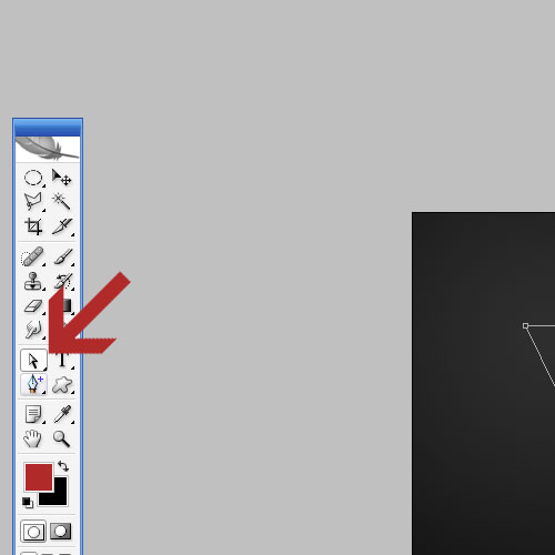
Step 4:
Now we want a variant of the Pen Tool called the Add Anchor Point tool. You can see it in the picture below.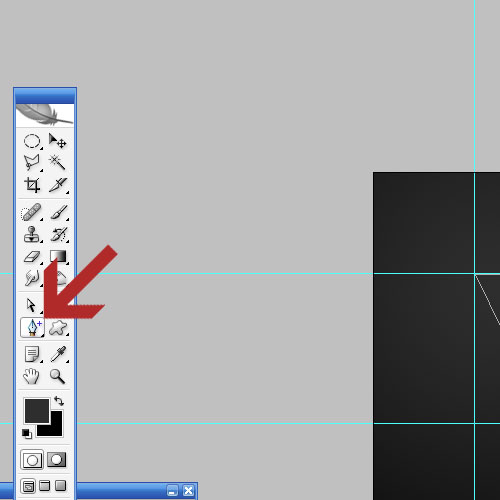
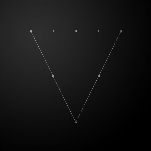
Step 5:
With the Add Anchor Tool selected and your guides still up, go through and add extra points in the positions shown below (note that I’ve switched off the guides with CTRL+’ so that I could screenshot it properly).You may be wondering why we didn’t just add all these points in the beginning rather than after we’d drawn the triangle. The answer is simply that it’s hard to get everything looking nice and symmetrical. This is just an easier way.
Step 6:
Now we are going to change to the Direct Selection Tool (A) which is the arrow shown. There are actually three Arrow tools in Photoshop, this one, it’s alternate which is called the Path Selection Tool and our regular arrow also called the Move Tool. What’s the difference?Well basically the Move Tool (the regular one) is for moving objects around as you do normally. These other two are for paths. The Direct Selection tool is for selecting either points or edges (the lines between the points). While the Path Selection tool is for moving the entire path around all together (without it losing shape).
The best way to understand them, of course, is to click on each one in turn and see what it does! But for now we just want the Direct Selection Tool.
Step 7:
So using the Direct Selection Tool, first click on the top middle point to select it. Now hold down Shift and press the Up arrow a couple of times and you’ll see the point move up. Next do the same with the left and right midpoints to make them move about.We hold down Shift because it makes movement faster (I think SHIFT+Arrow is the same as 10xArrow with no Shift).
Anyhow, move the points about until you have something like shown…
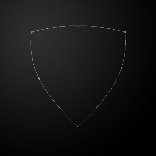
Step 8:
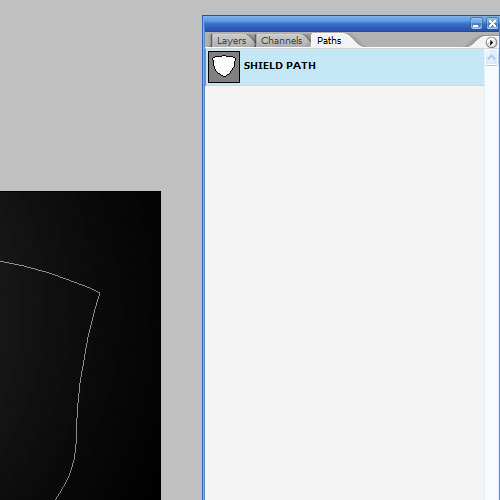
It’s up to you how you make your final path turn out, I made mine kinda quirky by just moving points about until they kinda looked like a shield. I saved the path in the PSD file for download in case you want that exact path. You can find it by clicking on the Paths tab and then you’ll see a path marked Shield Path.Any time you have a path you think you might want later, click to the Paths tab and then click on that little arrow pointing to the right and choose Save Path. This is particularly handy if you’ve spent a long time deep-etching a person out of a photograph and you want to make sure you don’t accidentally lose your path work.
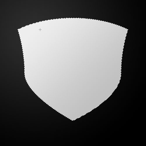
Step 9:
Next create a New Layer. Click on the Pen Tool and then right click anywhere on the canvas and choose Make Selection. You’ll get a little dialog box asking if you want to feather your selection, make sure it’s set to 0 (the default) and press OK.Next get a light grey to dark grey and draw a gradient in your new layer as shown.
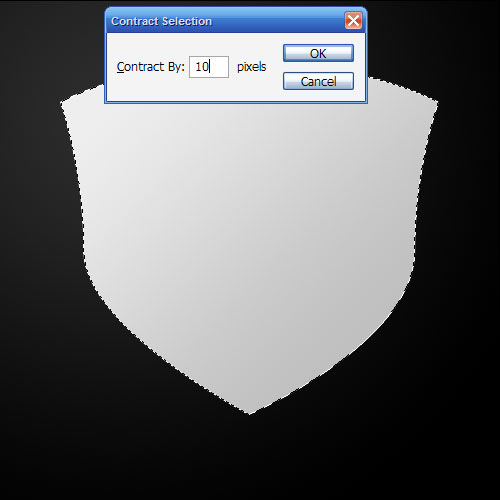
Step 10:
Now with that layer still selected, create a New Layer and go to Select > Modify > Contract and put in 10 pixels.Next draw a gradient going the OTHER way with the same two light grey and dark grey colors. So the first one should be from top-left to bottom-right. This new layer should be bottom-right to top-left. You can see the effect of the two gradients in the picture for the next step.
Step 11:
Next while your second layer is still selected, go to Select > Modify > Contract again and use 10pixels again. Then create a new layer, and this time with a Radial Gradient, draw in a nice orange gradient with the lighter part in the top left as shown.
Step 12:
Now go back to the middle layer and press Ctrl and click on the layer to select its pixels as shown. Create a New Layer above that one and fill it with white.Then go to Select > Modify > Contract and use a value of 1 pixel and then hit Delete. This will leave a one pixel thin white line between the two metallic gradients. It will look like the top of a ridge of metal (sort of …)

Step 13:
Ok, so here’s what we have so far. You can see that by using the two gradients going in opposite directions, we’ve created a sort of 3D effect which looks like light is coming from the top left and creating a highlight and shadow on the "metal."
Step 14:
Now we add a simple Drop Shadow and Inner Shadow to the orange layer. You can see these in the sample PSD file for download, but basically it’s just an inner shadow with distance of 0 so that the shadow is even around the edges, and similarly with a drop shadow. We want the inner shadow as it makes it look a little more three dimensional because the edges are curving away from the viewer’s perspective. The drop shadow is just to make the orange layer react a little more with the metal frame.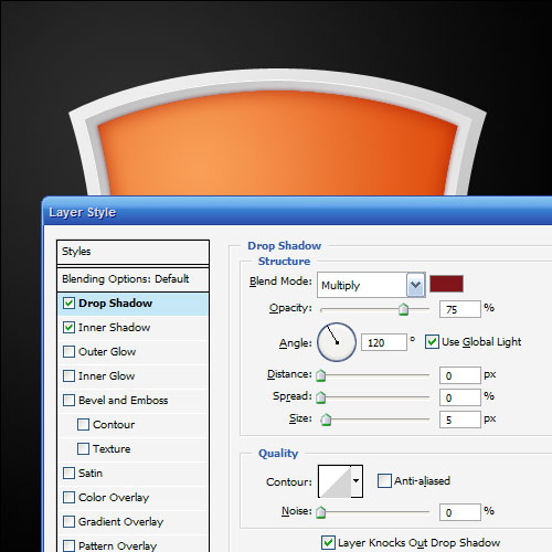
Step 15:
Here’s what we have now… It’s starting to look pretty cool. At this point I’ve also lightened the background (though it’s hard to tell now that I look at it). So here it’s a very dark grey, as opposed to black. Also I’ve added a drop shadow to the very first grey metal layer, though it’s pretty faint.
Step 16:
Now in a new layer at the very top, draw an ellipse with the Elliptical Marquee Tool (M) and fill it with white as shown.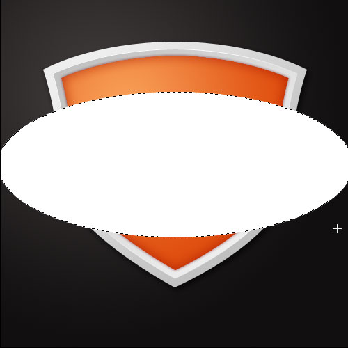
Step 17:
Now the only reason we’ve actually filled this with white is so that we can now press Ctrl-T and rotate the ellipse as shown.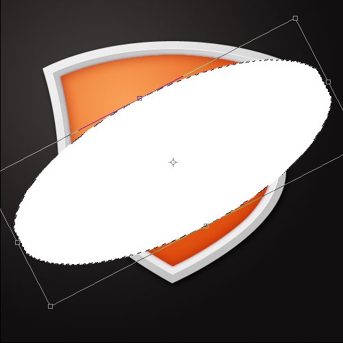
Step 18:
Once you’ve rotated the ellipse hold down Ctrl and click on that layer to select the ellipse and then delete the layer itself so you are left with just a selection shaped as an ellipse on an angle.Then create a new layer and draw a Radial Gradient going from white to transparent as shown.

Step 19:
Now hold down Ctrl and click on the orange layer to select its pixels and then press Ctrl+Shift+I to invert the selection (i.e. you’ll be selecting everything except the orange layer’s pixels) and then click on the very top layer, which has that white-transparent radial gradient from the last step, and press Delete. You should now have a highlight as shown.
Step 20:
Now set that highlight layer to a blending mode of Overlay and an Opacity of 60%. It should give a nice golden yellow as shown.
Step 21:
Now in create a new layer and then again hold down Ctrl and click on the orange layer to select its pixels. Then in the new layer draw a Linear Gradient downwards from black to transparent as shown.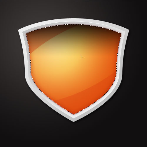
Step 22:
Set this new black layer to a blending mode of Soft Light and then hold down Ctrl and click on the orange layer yet again then hold down Shift and press the down arrow a few times to move the selection down. Next go back to that black layer and hit Delete to leave just a bar running along the top as shown.
Step 23:
At this point, I decided to brush the metal up a bit. To do this, click on either of the two grey layers and with the Burn Tool (O) selected and a soft brush, just darken the parts that are darker and lighten the parts that are lighter as you see fit. I did this just to get a bit more contrast as shown. Don’t forget if you hold down Alt while using the Burn Tool it changes to the Dodge Tool (which lightens instead of darkening) so you don’t need to keep switching between them.
Step 24:
OK now for the radial burst in the background. Choose the Custom Shape Tool (U) and select the shape shown below.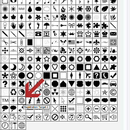
Step 25:
Create a new layer just above the dark grey background and, using white as your foreground color, draw a very large version of that shape as shown. This makes a kind of vector starburst effect.
Step 26:
Now set that layer to Overlay and 30% opacity so it’s much fainter. Finally in a layer at the very top, I added a giant S in a darkish red color and set it to Multiply at 20%. Then I wrote a word over the top and we’re finished! A bit of a strange effect, but a fun one nonetheless!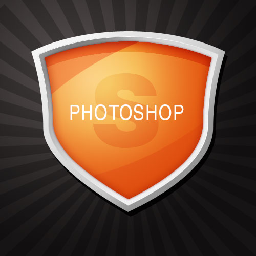

0 Response to "Making a Photoshop Logo"
Post a Comment